


People like to dunk on Product Managers for setting 3 hour meetings to ultimately decide to change a button color.
Generally, I’d agree that the impact of the color of a button isn’t important, but early in my career a change in button color resulted in conversion moving from ~5% to 75-80% (albeit without a marathon meeting).
As a new associate PM, I was on a team responsible for a ground-up rebuild of our data query UI and subsequent user migration. And for context, no, we did not have a designer on the team at this point in time.
After launching the alpha version, we quickly realized we had a problem:
✅ Customers were logging in to the product
❌ They were not running queries (which was kind of the whole point of the UI - so that wasn’t good).
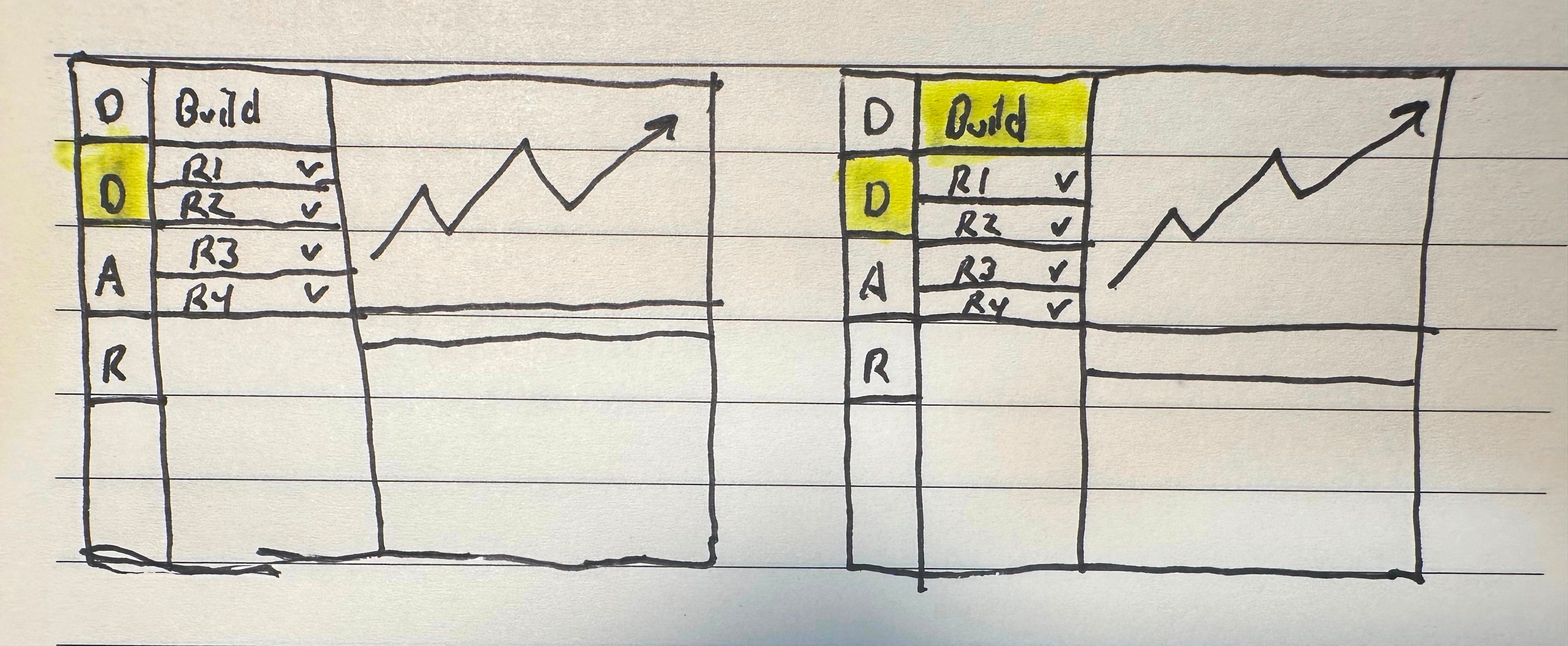
We wired up additional analytics for key steps between hitting the post-login landing page and clicking “Run” to submit a query. The data showed that people were successfully navigating to our “Data” page but weren’t finding the button to build a new report. It wasn’t highlighted as the next key step in the workflow.
Circled with the engineers, decide to highlight the button in green and push the change.
Like magic (or just good UX) conversion immediately skyrocketed:
- Before: ~5% of users running queries
- After: ~80% of users running queries
Lessons learned:
1. Nudges in your product matter. If there’s a “default” or most likely path that users should take through your product, highlight those buttons.
2. Just hire a designer. You’re saving no $$$ making stupid mistakes like we made.